

Screen layout
The dashboard is organized into the following sections.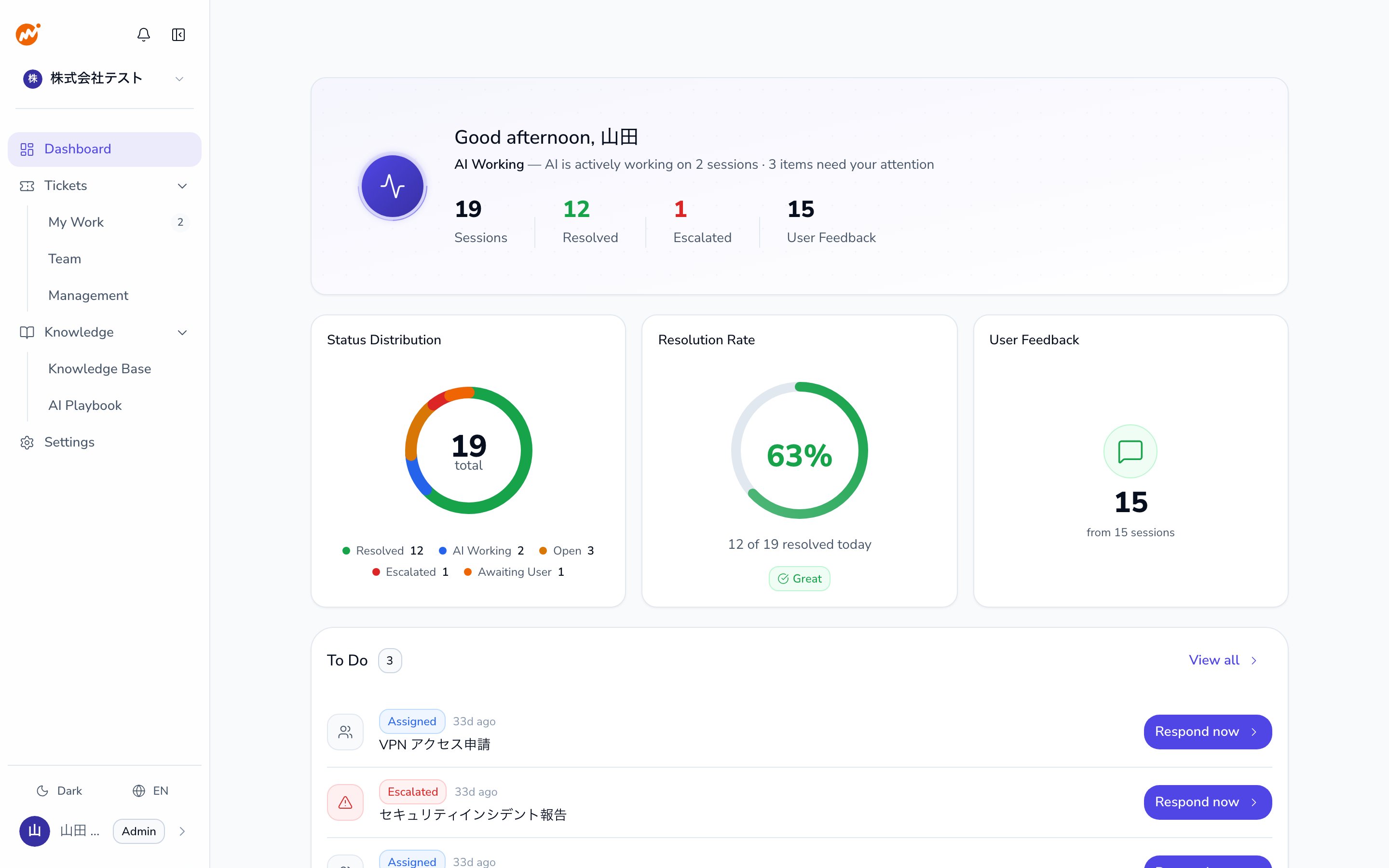
Hero section (top)
The “AI Working” count shows how many sessions the AI is currently handling. A higher number means the AI is actively responding to more requests.
3-column bento grid (middle)
Status distribution
A donut chart showing the breakdown of all sessions by status. Hover over each segment to see details.
Resolution rate
AI-resolved sessions ÷ total sessions as a percentage. Green at 60%+, yellow at 30–60%, red below 30%.
User Feedback
The number of feedback items received from users.
Status types
To Do list (bottom)
A list of sessions assigned to you that need attention.- Escalated (red): Sessions escalated to you that require human action
- Assigned (blue): Sessions assigned to you
Org Overview (admins only)
Admins see an Org Overview section with summary cards for all sessions in the organization. Cards are broken down by the five status types.Org Overview is only visible to Admins. Operators do not see this section.
Improving resolution rate
If the resolution rate is low, consider the following:- Whether the AI has enough knowledge to answer questions (knowledge base coverage)
- Whether escalation patterns are concentrated in specific inquiry categories
- Whether any common inquiries could be handled automatically with playbooks